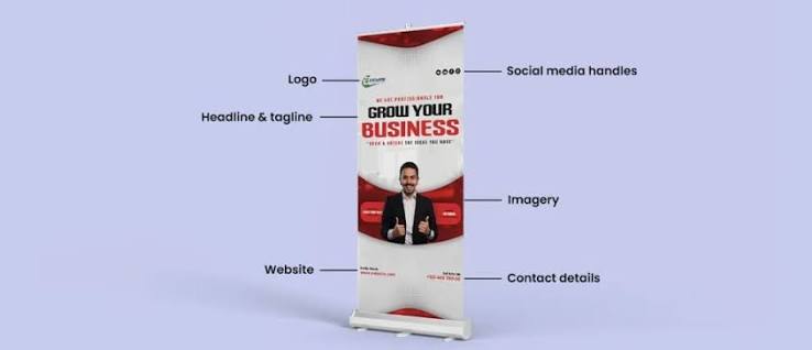
The retractable roll-up stand is the default piece of portable display equipment for trade shows, conferences, receptions and shop interiors, and it is bought almost entirely on price. That is understandable and slightly unfortunate, because the mechanical difference between a cheap stand and a good one is large, and the design difference between an effective banner and an ignored one is larger still. This article covers both.
The mechanism, and why it matters
Inside the aluminium base is a spring-loaded roller, much like a window blind. The printed graphic is attached to the roller at the bottom and to a rail at the top; pulling it up unwinds the roller against spring tension, and a pole holds it extended. Release the pole and the spring retracts the graphic into the case.
Three things separate a stand that lasts years from one that fails at its third event.
Spring quality and tensioning. A well-made stand holds the graphic taut without over-tensioning it. A cheap one is either too weak — the banner sags and curls — or too strong, which stresses the graphic and makes retraction snap violently, creasing the print.
Base weight and feet. A good base is heavy enough to resist a knock and has feet that swing out for stability. A light base with fixed feet tips over, which at a busy exhibition happens regularly.
Pole construction. Three-section poles with a proper internal bungee are fine. Cheap poles with loose joints let the banner lean forward.
Broadly, stands fall into three tiers: economy (single-use, one or two events), standard (regular use, replaceable graphic in some models), and premium (double-sided, wide-format, or cassette systems designed for graphic changes with a heavy weighted base). If a stand will travel to more than three or four events, the standard tier is the false economy line — below it, replacement costs more than the upgrade would have.
Standard sizes
The common widths are 60 cm, 85 cm, 100 cm and 120 cm, with 85 × 200 cm being the near-universal default. Wide-format stands at 150 cm and 200 cm exist and are useful as a backdrop, though they are heavier and less genuinely portable.
The 85 × 200 cm size is standard for a good reason: it fits through doorways, fits a car boot, occupies little floor area at a stand, and puts the top of the graphic just above head height. Unless there is a specific reason to deviate, it is the right choice.
The single most important design rule: the safe zones
A roll-up banner has two areas that are not reliably visible, and ignoring them is the most common design error.
Bottom safe zone. The lowest 10-15 cm of the graphic sits inside or immediately above the base housing, and in a crowded room the lower 40-50 cm is blocked by people, tables and chairs. Nothing important goes in the bottom 50 cm. In practice, treat the bottom fifth of the banner as decorative background only.
Top attachment. The top 2-3 cm is gripped by the rail. Keep content clear of it.
Side margins. Leave at least 2 cm each side clear of critical content, since the graphic can sit fractionally off-centre.
The corollary is that the effective design area on an 85 × 200 cm stand is roughly 85 × 145 cm, positioned in the upper three-quarters. Design in that space.
The visual hierarchy that works
A roll-up is read by someone walking past at two to four metres, in about three seconds. That constrains the design more than most people accept.
Top third — identity. Logo and a single headline stating what you do. This is the eye-level zone and the only part guaranteed to be visible over a crowd. The headline should be readable at four metres, which means capital letters of roughly 6-10 cm.
Middle third — substance. Three to five short benefit statements, or one strong image. Not paragraphs. If a visitor is close enough to read body text, they are close enough to talk to.
Bottom third — contact and background. Website, QR code and contact details positioned at the upper end of this zone, around 60-80 cm from the bottom, where they remain visible over a table.
A QR code deserves a specific note: make it at least 4 × 4 cm, place it at roughly chest height rather than at the bottom, and put one line of text under it saying what scanning gets you. A code with no explanation is scanned far less often.
Contrast, colour and typography
Exhibition halls are visually chaotic. A banner competes with dozens of others, most of them shouting.
Reduce, do not add. The most effective stands at any exhibition are almost always the simplest — a strong image, a clear headline, generous empty space. Empty space reads as confidence.
Contrast beats brightness. High contrast between text and background matters more than colour saturation. Pale grey text on white is invisible at three metres regardless of how elegant it looks on a monitor.
Two typefaces maximum, and avoid light weights at display sizes — thin type disappears at distance under mixed hall lighting.
Test at scale. Print the design on A4 and view it from 40 cm. That approximates the 85 × 200 cm banner viewed from about 2.5 metres. Anything you cannot read in that test will not be read at the event.
Material and print specification
Roll-up graphics need to be opaque, dimensionally stable and non-curling.
Blockout PVC film (typically 440-510 g/m²) is the standard. The grey or black core layer prevents light and lighting rigs behind the stand from showing shadows through the graphic.
Polypropylene / PET film is lighter, has no PVC, lies flatter and resists curling better in temperature swings. Slightly more expensive and increasingly the preferred option.
Textile / polyester fabric gives a matte, glare-free surface that photographs well and is popular for premium stands. It creases more easily in transport.
Always specify an anti-curl or matte laminate. Curl at the vertical edges is the most visible sign of a cheap roll-up, and lamination largely prevents it. Matte finish also eliminates glare from hall spotlights, which on a gloss banner can render an entire section unreadable.
Preparing the file
- Design at full size (e.g. 850 × 2000 mm) at 100-150 dpi, or at 1:4 scale at 300 dpi.
- Add extra height at the bottom — usually 5-10 cm beyond the visible area for the roller attachment. Confirm the exact figure with your supplier, since it varies by hardware.
- CMYK, converted before sending, with Pantone references supplied for brand colours.
- Vector logos and outlined fonts.
- Images at 150 dpi at final size minimum. A logo pulled from a website will not survive enlargement to 40 cm wide.
- PDF/X-4, with the extra bottom allowance included and clearly marked.
If you are ordering Roll-up stendai for the first time, ask the supplier for their exact template — hardware differs, and using the manufacturer’s own template removes the guesswork about bottom allowance and grip area entirely.
Practical use at events
Place the stand beside or behind you, not in front — a banner blocking the person is a common self-inflicted problem. Two stands flanking a table make a stronger visual frame than one in the centre. Avoid positioning directly under a downlight, which creates glare on the upper portion.
Transport in the padded bag supplied and store standing upright rather than laid flat with weight on top. When retracting, control the graphic with your hand rather than letting the spring snap it back — an uncontrolled retraction is what creases the top edge.
If the graphic creases, hang it extended overnight; most creases in film relax out. Deep creases across the printed area generally do not, which is the argument for controlled retraction every time.
Getting more than one event out of one purchase
Two habits make a real difference to cost per event. First, design the graphic so that dated content — a specific offer, a show name, a year — is either absent or confined to a small area, so the banner remains usable next season. Second, buy a stand with a replaceable cassette if you expect to change the message; the hardware then survives many graphics, and a replacement print costs a fraction of a complete new stand. Full-service printers such as https://www.printobella.lt generally supply both the hardware and the replacement graphics, which keeps the sizing consistent when you reprint.
Summary
- 85 × 200 cm is the sensible default; spend on base weight and spring quality if the stand will travel.
- Nothing important in the bottom 50 cm; effective design area is the upper three-quarters.
- Logo and one headline at the top, three to five short points in the middle, contact and QR at chest height.
- Blockout PVC or PET film, always with a matte anti-curl laminate.
- Design at full size, CMYK, vector logos, and use the supplier’s own template for bottom allowance.
- Retract by hand, store upright, and keep dated content out of the design.